
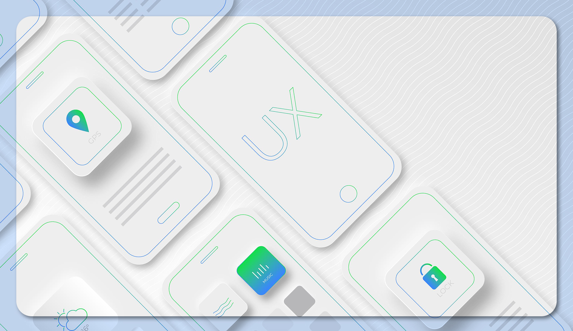
In the digital age, where every pixel matters and attention spans wane faster than ever, the art of minimalist design has emerged as a beacon of clarity. Imagine stepping into a serene space after leaving behind a bustling, chaotic crowd. That’s what minimalist UI/UX design does for your users. It transforms overwhelming interfaces into intuitive, delightful experiences. Let’s explore how this approach can elevate user engagement and why simplicity is not just a trend but a necessity.
Content Table
| S.NO. | Content |
| 1 | The Power of Less: Why Minimalism Works |
| 2 | Key Principles of Minimalist UI/UX Design |
| 3 | Real-World Examples of Minimalist Design |
| 4 | Why Minimalism Drives Engagement |
| 5 | Embracing Simplicity in Your Designs |
| 6 | Conclusion: From Chaos to Clarity |
The Power of Less: Why Minimalism Works
The minimalist design philosophy centers around one core principle: less is more. By eliminating distractions and prioritizing essential elements, users can focus on what truly matters. Here’s why this approach is so impactful:
- Clarity Boosts Comprehension
A clutter-free interface guides users seamlessly, reducing confusion. Clear typography, ample white space, and intuitive navigation ensure users find what they need without frustration. - Speed Enhances Experience
Simpler designs load faster. In a world where seconds can make or break user satisfaction, minimalism ensures your platform remains swift and responsive. - Aesthetic Appeal
Clean, organized visuals create a sense of professionalism and trust. Users are more likely to engage with interfaces that feel polished and intentional.
Key Principles of Minimalist UI/UX Design
Achieving minimalist design isn’t about stripping everything down to the bare minimum. It’s about intentionality. Here are the building blocks:
- Purposeful Use of Space
White space isn’t wasted space—it’s breathing room for your content. It directs attention and enhances readability. - Prioritization Through Hierarchy
Use size, color, and placement to highlight the most critical elements. A clear visual hierarchy helps users navigate effortlessly. - Thoughtful Typography
Fonts convey personality and function. Choose typefaces that are both legible and aligned with your brand identity. - Subtle Color Palettes
Minimalism thrives on harmonious, muted tones. Bold colors should be reserved for calls to action or highlighting key information. - Streamlined Interactions
Reduce the number of steps required for a user to complete a task. Every click or scroll should have a purpose.
Real-World Examples of Minimalist Design
- Apple: Apple’s website and products epitomize minimalism. With a focus on clean lines, ample white space, and intuitive navigation, their design communicates sophistication and functionality.
- Google Search: A single search bar, minimal text, and ample space make Google’s homepage one of the most iconic examples of minimalist UI.
- Airbnb: Airbnb’s platform simplifies complex processes like booking a stay or hosting a property through clean visuals and straightforward navigation.
Why Minimalism Drives Engagement
Minimalist design doesn’t just look good—it performs. Here’s how it boosts user engagement:
- Reduces Cognitive Load: By eliminating unnecessary elements, users can focus on their goals without distractions.
- Enhances Accessibility: Simpler designs are often more accessible, accommodating diverse user needs.
- Encourages Action: Clear calls-to-action stand out in uncluttered layouts, driving conversions.
Embracing Simplicity in Your Designs
Transitioning from a feature-packed design to a minimalist approach requires a mindset shift. Here’s how to get started:
- Audit Your Interface: Identify elements that don’t add value and remove them.
- Define User Goals: Focus on the most critical actions users need to take and design around those.
- Test and Iterate: Minimalism thrives on refinement. Gather feedback and make continuous improvements.
Conclusion: From Chaos to Clarity
In a world brimming with information overload, minimalist UI/UX design offers a breath of fresh air. By focusing on clarity, simplicity, and purpose, you create experiences that resonate with users on a deeper level. Remember, minimalism isn’t about doing less—it’s about doing more with less. So, strip away the chaos, and let clarity lead the way.