

In the fast-paced digital world, where information overload is the norm, clarity is king. For startups, creating a digital presence that captivates, engages, and converts is essential. One of the most powerful yet underrated design elements that can achieve this? White space.
Content Table
| S.no. | Content |
| 1 | What is White Space? |
| 2 | Why White Space Matters for Startups |
| 3 | How Startups Can Use White Space Effectively |
| 4 | Final Thoughts |
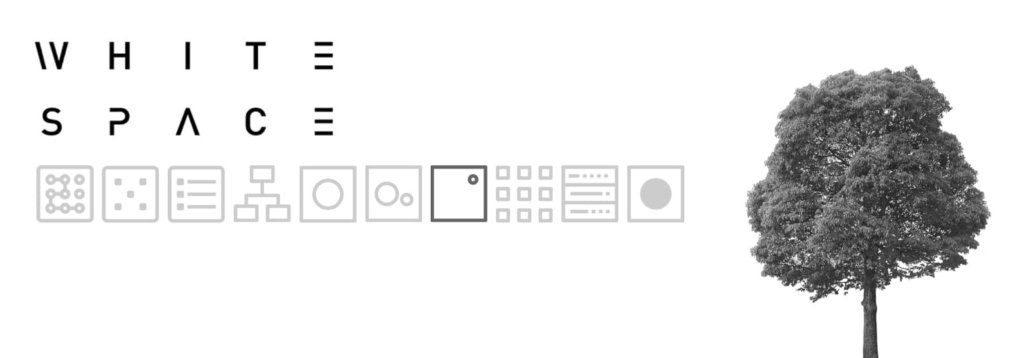
What is White Space?
White space, often referred to as negative space, is the empty space between elements in a design. It doesn’t necessarily have to be white—it simply means areas devoid of content, allowing the design to breathe. Contrary to common belief, white space isn’t wasted space; rather, it’s an active component that enhances user experience and interaction.
Why White Space Matters for Startups
1. Enhances Readability
Startups often have a lot to say, but an overcrowded digital design can make content difficult to digest. Proper use of white space improves readability, making it easier for users to absorb information and take action.
2. Creates a Sense of Sophistication and Simplicity
Minimalistic designs exude professionalism. When startups use white space effectively, their websites and apps appear cleaner, more elegant, and more intuitive. Think about the websites of major tech giants—Apple, Google, and Airbnb. Their designs embrace white space, making them visually appealing and easy to navigate.
3. Drives Focus to Key Elements
White space helps direct users’ attention to what matters most. Whether it’s a call-to-action button, a compelling headline, or a key product feature, strategically placed white space ensures these elements stand out without distraction.
4. Boosts User Experience and Engagement
A cluttered interface overwhelms visitors, leading to higher bounce rates. White space reduces cognitive load, making interactions smoother and more enjoyable. Users are more likely to engage, stay longer, and return when they feel at ease navigating a website or app.
5. Encourages Visual Hierarchy
White space helps establish a clear visual hierarchy, guiding users through content in a logical and intuitive way. This is particularly important for startups looking to drive conversions, as it ensures the most important messages don’t get lost in the noise.
How Startups Can Use White Space Effectively
- Break Up Text: Use ample spacing between paragraphs and sections to improve readability.
- Use Padding and Margins: Generous spacing around images, buttons, and text elements prevents a cluttered look.
- Balance Content and Empty Space: Avoid cramming everything into one section—give elements room to breathe.
- Let White Space Frame Content: Treat white space as an invisible frame that highlights key messages and visuals.
Final Thoughts
White space is more than just an aesthetic choice—it’s a strategic tool that can elevate a startup’s digital design. By embracing white space, startups can create an intuitive, engaging, and visually stunning digital presence that leaves a lasting impression.
So, the next time you’re designing your website, app, or digital content, remember: sometimes, less truly is more.