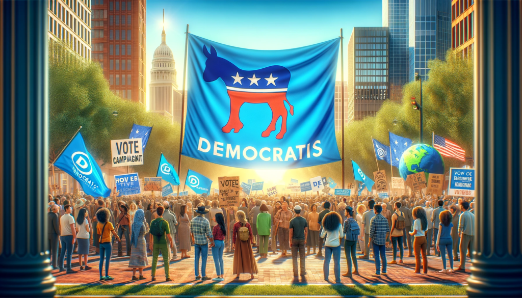
In an era flooded with information, political advocacy campaigns must cut through the noise to capture attention and inspire action. One of the most effective ways to do this is through minimalist design—a strategy that embraces simplicity, clarity, and strong visual impact.
Content Table
| S.no. | Content |
| 1 | Why Minimalist Design Works for Political Advocacy |
| 2 | Key Elements of Minimalist Political Advocacy Design |
| 3 | Real-World Examples of Minimalist Political Design |
| 4 | Final Thoughts: Less is More |
Why Minimalist Design Works for Political Advocacy
Minimalism in design is not about doing less but about doing more with less. When used effectively, it removes distractions and ensures that key messages are clear and persuasive. Here’s why minimalist design is a game-changer for political advocacy:
1. Clarity and Focus
Minimalist design eliminates clutter, allowing your audience to focus on the most important message. A simple, bold slogan with clean typography can make a bigger impact than a crowded poster filled with unnecessary details.
2. Emotional Impact
A well-placed image, a single powerful word, or a strategic use of color can evoke strong emotions. When every design element is intentional, it strengthens the campaign’s message and makes it memorable.
3. Versatility Across Platforms
From social media graphics to billboards, minimalist designs are adaptable and effective across all formats. A strong, simple design works equally well on a smartphone screen as it does on a large print banner.
4. Instant Recognition
Think of some of the most iconic political campaigns in history—many relied on simple yet striking visual elements. A clean, bold logo or a distinctive color scheme can make your movement instantly recognizable.
Key Elements of Minimalist Political Advocacy Design
- Limited Color Palette – Stick to one or two dominant colors that reflect the campaign’s identity. For example, blue for trust, red for urgency, and green for sustainability.
- Strong Typography – Choose clean, bold fonts that are easy to read at a glance. Avoid decorative or complicated typefaces.
- Whitespace Matters – Give elements room to breathe. Empty space enhances clarity and keeps the design from feeling overwhelming.
- Powerful Imagery – Use high-quality, meaningful visuals that reinforce the campaign’s message without excessive detail.
- Concise Messaging – Craft slogans that are short, powerful, and easy to remember. Less is more when it comes to impactful wording.
Real-World Examples of Minimalist Political Design
- Barack Obama’s “Hope” Poster – A simple yet powerful portrait in a limited color palette that became an icon of change.
- Greta Thunberg’s Climate Strikes – Signs with short, direct messages like “School Strike for Climate” that immediately convey urgency.
- Black Lives Matter – A simple black background with white bold text creates a stark, undeniable statement.
Final Thoughts: Less is More
Minimalist design in political advocacy campaigns isn’t just a trend—it’s a strategy that ensures messages are seen, understood, and remembered. By focusing on clarity, impact, and simplicity, you can create powerful visuals that drive real change.
So, next time you’re crafting a political campaign, remember: simplicity speaks volumes.

