
The Olympic Games, a celebration of human achievement and global unity, have long been symbolized by the awarding of medals to the top athletes. These medals are not just rewards; they are iconic symbols of excellence, dedication, and triumph. Over the years, the design of Olympic medals has evolved, reflecting changes in artistic styles, technological advancements, and cultural values. This blog delves into the fascinating history of Olympic medal design, highlighting key moments and notable designs that have left a lasting impression.
The Early Years: Simplicity and Symbolism
- The 1896 Athens Olympics
The first modern Olympic Games held in Athens in 1896 set the stage for the tradition of awarding medals. However, unlike today, there were no gold medals. Winners received silver medals, while runners-up were awarded copper medals. These early medals were simple in design, featuring an image of Zeus holding Nike, the goddess of victory, on one side, and the Acropolis of Athens on the other. The simplicity of these medals underscored the emphasis on participation and the revival of the Olympic spirit.
- The 1900 Paris Olympics
The 1900 Paris Olympics saw a departure from the traditional medal format. Instead of medals, winners received rectangular plaques made of various metals. The design featured an allegorical representation of victory, with an athlete being crowned by a female figure. This unique approach reflected the artistic experimentation of the time, aligning with the Art Nouveau movement that was popular in France.
The Golden Age: Innovation and Elegance
- The 1928 Amsterdam Olympics
The Amsterdam Olympics in 1928 marked a significant milestone in Olympic medal design. Italian sculptor Giuseppe Cassioli created a design that would become the standard for many future Games. His design featured Nike holding a winner’s crown in one hand and a palm frond in the other, with the Coliseum in the background. This iconic design emphasized the connection between ancient and modern Olympic traditions and remained in use, with minor modifications, until 1968.
- The 1936 Berlin Olympics
The Berlin Olympics in 1936 saw a continuation of Cassioli’s design but with a unique touch. The reverse side of the medals depicted an athlete being carried by a crowd, symbolizing unity and celebration. This was a subtle nod to the propaganda aims of the Nazi regime, which sought to showcase Germany’s strength and organization. Despite the political undertones, the medals were admired for their artistic quality and craftsmanship.
The Modern Era: Diversity and Creativity
- The 1964 Tokyo Olympics
The 1964 Tokyo Olympics introduced a new era of medal design, reflecting Japan’s blend of tradition and modernity. The medals featured Cassioli’s standard design on the front but incorporated Japanese elements on the reverse, such as a depiction of the Olympic rings and laurel leaves. This fusion of East and West symbolized Japan’s post-war recovery and its emergence as a global power.
- The 2000 Sydney Olympics
The Sydney Olympics in 2000 took a bold step in medal design, with a focus on the natural beauty of Australia. The medals featured a modernized version of Cassioli’s design on the front, while the reverse showcased the Sydney Opera House and the Olympic torch. The inclusion of indigenous motifs and vibrant colors highlighted Australia’s rich cultural heritage and its connection to the land.
Technological Advancements: Precision and Innovation
- The 2012 London Olympics
The London Olympics in 2012 embraced modern technology and precision in medal design. The medals were the largest and heaviest in Olympic history, featuring a complex design by artist David Watkins. The front of the medals retained the traditional depiction of Nike, while the reverse featured the London 2012 emblem set against a radiating background. The use of laser engraving and intricate detailing demonstrated the advancements in medal manufacturing techniques.
- The 2016 Rio de Janeiro Olympics
The Rio Olympics in 2016 introduced medals with a strong emphasis on sustainability. The medals were made from recycled materials, including silver extracted from used mirrors and X-ray plates, and bronze from scrap metal. The design featured Nike on the front, while the reverse depicted laurel leaves surrounding the Rio 2016 logo. This approach reflected the growing awareness of environmental issues and the need for sustainable practices in all aspects of the Games.
Paralympic Medals: Celebrating Inclusivity
- The 2008 Beijing Paralympics
The Beijing Paralympics in 2008 marked a significant step forward in the design of Paralympic medals. The medals featured a unique circular design with a jade inlay, symbolizing honor and respect in Chinese culture. The front of the medals depicted the Paralympic emblem, while the reverse featured the Great Wall of China. This design honored the achievements of Paralympic athletes and celebrated their contributions to the Olympic movement.
- The 2020 Tokyo Paralympics
The Tokyo Paralympics in 2020 continued the tradition of innovative and meaningful medal design. The medals featured raised dots on the surface to help visually impaired athletes identify their achievements. The front of the medals depicted the Paralympic emblem, while the reverse showcased traditional Japanese patterns symbolizing diversity and harmony. This thoughtful design highlighted the importance of inclusivity and accessibility in the Paralympic Games.
Cultural Significance: Reflecting Host Nations
- The 1984 Los Angeles Olympics
The Los Angeles Olympics in 1984 saw a departure from Cassioli’s design, with a fresh and modern approach. The front of the medals featured the goddess Nike, while the reverse showcased the Los Angeles Memorial Coliseum. This design celebrated the host city’s iconic landmark and its role in Olympic history. The use of bold, contemporary lines reflected the vibrant and dynamic spirit of Los Angeles.
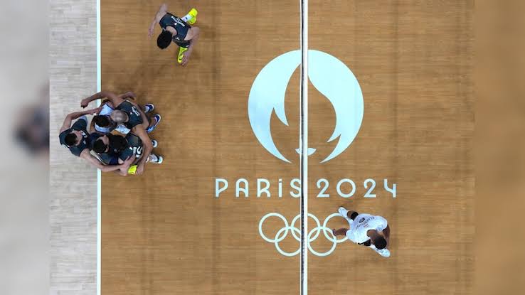
- The 2024 Paris Olympics
As we look forward to the Paris Olympics in 2024, medal design continues to evolve, reflecting the host nation’s cultural heritage and artistic vision. While the exact design is yet to be revealed, it is expected to embody the elegance and sophistication of French art and craftsmanship. The use of advanced materials and innovative techniques will likely create medals that are not only visually stunning but also meaningful symbols of achievement.
Conclusion
The art of the Olympic medal is a fascinating journey through history, reflecting changes in artistic styles, technological advancements, and cultural values. From the simple yet symbolic designs of the early Games to the innovative and inclusive medals of the modern era, each medal tells a story of human achievement and the spirit of the Olympics. As we look to the future, the evolution of medal design will continue to inspire and celebrate the excellence of athletes from around the world.