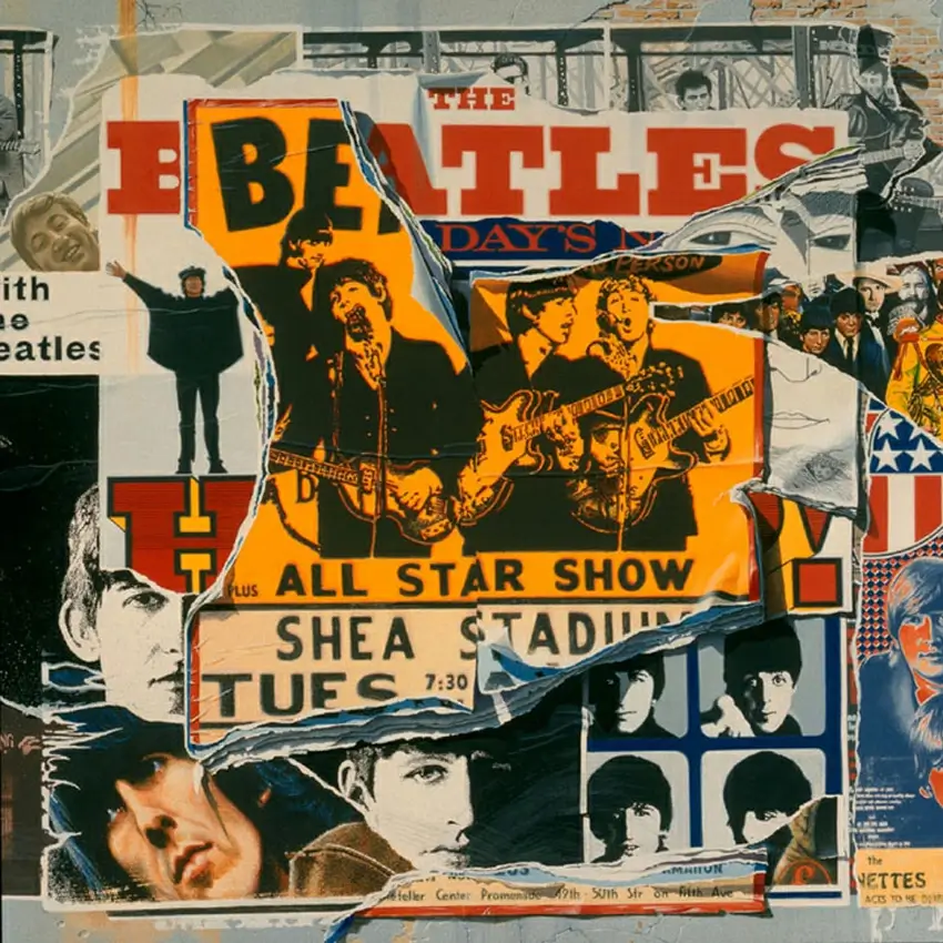
In the world of music, first impressions matter. Before a listener hits play, the album cover is often the first thing they see. A well-designed cover can captivate, intrigue, and communicate the essence of the music inside. In recent years, minimalist album covers have gained popularity for their ability to deliver maximum visual impact with simple, clean designs. But how do you create such striking visuals without overcomplicating them? Let’s explore.
Content Table
| S.no. | Content |
| 1 | Embrace Simplicity |
| 2 | Play with Negative Space |
| 3 | Choose a Bold, Limited Color Palette |
| 4 | Typography as a Statement |
| 5 | Focus on One Powerful Concept |
| 6 | Consistency with Musical Style |
| 7 | Keep the Audience in Mind |
| 8 | Conclusion |
1. Embrace Simplicity
Minimalism is all about stripping away the unnecessary. Focus on essential elements that represent the music. A single bold shape, a striking color, or an evocative image can speak volumes. Think about the core message or feeling of the album and how it can be expressed with as few visual elements as possible.
Example: The Beatles’ “White Album”—a plain white cover with subtle embossing—speaks louder than any busy design ever could.
2. Play with Negative Space
Negative space (the empty space around and between design elements) is a powerful tool in minimalist design. It draws attention to the focal point and gives the design room to breathe. Clever use of negative space can create hidden meanings or dual images, adding layers of intrigue while keeping the design clean.
Tip: Experiment with asymmetrical layouts and generous spacing to guide the viewer’s eye.
3. Choose a Bold, Limited Color Palette
Minimalist designs often rely on a limited color palette. Select one or two bold colors that reflect the mood of the music. Contrast is key here—a pop of vibrant color on a muted background can create a visually arresting design.
Insight: Colors evoke emotions. Red for passion, blue for calm, black for sophistication—choose hues that align with the album’s theme.
4. Typography as a Statement
When text is used minimally, it becomes more impactful. Choose a font that complements the music’s style and let it breathe. Sometimes, the album title or artist’s name alone, placed thoughtfully, can become the central visual element.
Creative Approach: Custom typography or hand-lettered titles can add a personal touch without complicating the design.
5. Focus on One Powerful Concept
Minimalist album covers often revolve around a single, strong concept. It could be an abstract symbol, a close-up photograph, or a simple graphic that hints at the story within the album. The key is to let that concept shine without distractions.
Case Study: Adele’s “25” features a close-up portrait that’s intimate and powerful—minimal elements, maximum emotion.
6. Consistency with Musical Style
The cover should reflect the music’s tone. A minimalist jazz album cover might use smooth lines and warm tones, while a minimalist electronic album might feature geometric patterns and cool hues. Ensure that the visual tone matches the auditory experience.
7. Keep the Audience in Mind
Consider who the album is for. What kind of visuals will resonate with that audience? Minimalism doesn’t mean the design has to be cold or distant—it should connect with the listener on an emotional level. The design should invite curiosity and reflect the soul of the music.
Conclusion
Minimalist album covers prove that less can truly be more. By focusing on essential elements, using negative space wisely, selecting bold color palettes, and aligning design with musical style, you can create covers that make a powerful statement. In a world filled with visual noise, minimalist designs cut through the clutter and linger in the mind—reminding us that sometimes, simplicity says it best.
So, next time you’re designing an album cover, remember: a minimalist approach might just make the loudest impact.

